Docs
Thank you for choosing the Lightweight theme for your Shopify store! This comprehensive documentation is your go-to resource for maximizing the potential of your online store using the Lightweight theme. Whether you’re a beginner or an experienced user, this guide will walk you through the various features, customization options, and best practices to create a stunning and user-friendly e-commerce website.
Our team has meticulously crafted the Lightweight theme to provide you with a seamless and intuitive experience. With its sleek design, performance-focused architecture, and versatile customization capabilities, you’re empowered to create a unique and engaging online presence that resonates with your brand.
Navigate through this documentation to learn how to harness the power of the Lightweight theme’s features, including its sections, settings, and integrations. From configuring your homepage to fine-tuning typography, color schemes, and responsive design, we’ve got you covered.
Announcement Section
Grab your visitors’ attention, announce important updates, and drive conversions using our intuitive customization options.
Top Bar Settings
Adding Text
Input your message concisely to communicate with customers.
Changing Text Color
Customize text color to align with your branding.
Modifying Background Color
Personalize the background color of your announcement bar for a cohesive and look.
Setting Redirect Link
Add a link to direct customers to relevant content.
Popup Settings
The Popup feature enables you to create an engaging two-column popup with customizable elements to effectively convey your message and promote user engagement throught a subscription form.
Logo and Title
Upload your logo to reinforce brand identity.
Set a title to grab users’ attention and communicate your message effectively.
Content and Subtitle
Craft compelling content to provide value and relevance.
Include a subtitle for additional context and clarity.
Image (Desktop Only)
Upload an image that resonates with your message and captures interest.
Call to action
Select wheter you want to add a newsletter subscrition form to your popup or not.
Time
Choose the time delay after page load for the popup to appear.
Terms and conditions
Provide essential terms and conditions information in order to ensure transparency and build trust with your audience.
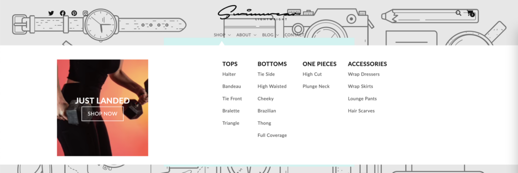
Header
The Header section is a permanent section in your storefront. It is visible on every page of your store, and features your social media links, brand’s logo, menu navigation, search bar and shopping cart.
Search: …
QuickView: …
When a top menu item has children, a dropdown menu is shown when clicked. When a top menu item has grand-children, a mega menu is shown when clicked and the child menu items are shown as columns inside the mega menu.
You can add a Mega menu call to action block to the header that will appear on all mega menus. You can choose whether to show the call to action on the left or right of the mega menu, choose the color scheme, choose an image for the background, change the width and change the text for the title and call to action, finally you can choose the link to go to when clicked.
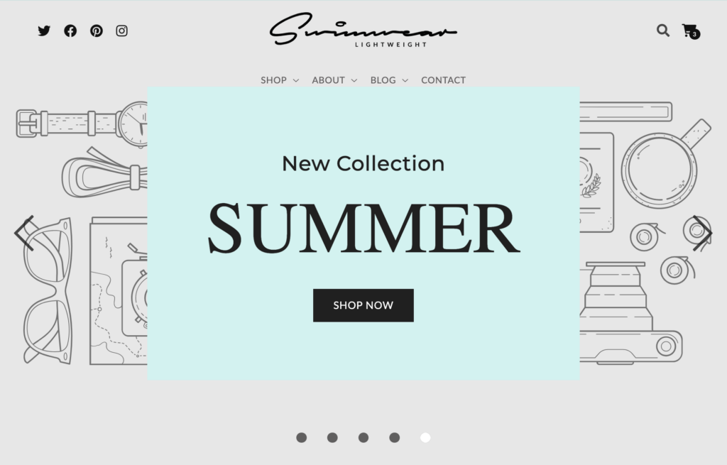
Main Banner
The Main Banner Section is an image slider with an overlay that has a description, title and button.
In the section settings, you can change:
- The alignment of the overlay content (Description, title and button) for Desktop and Mobile layouts individually.
- Whether or not to show a box that surrounds the overlay content and choose it’s color scheme
- The speed at which each slide changes. It can be “Slow”, “Normal” or “Fast”
- Whether or not to show the slider navigation dots
- Whether or not to show the slider navigation arrows
You can change the text, font family, size and color for the description and title individually. For the button, you can change the text, the optional link to go to when clicked and choose between two styles. The primary style fills the button with a dark background and the secondary style makes the button transparent with a light outline.
You can add slides to the Main Banner. A slide is an image background for the section that slides by automatically. For each slide you can change:
- Image for Desktop
- Position for desktop image (Only applies if the aspect ratio does not correspond with the section’s size)
- Image for Mobile
- Position for mobile image (Only applies if the aspect ratio does not correspond with the section’s size)
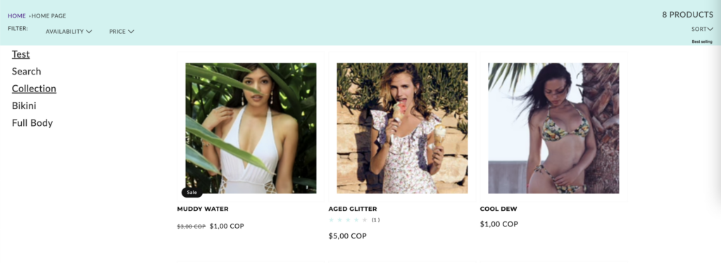
Product grid
The Product grid section is a section that can be used exclusively in the Collection template. It displays the collection’s products in a grid format with paging functionality.
You can change:
- The number of products to show per page. You can choose between 3, 6 or 9 products.
- The product card settings:
- Image ratio – Adapt to image, Portrait or Square
- Show second image on hover
- Add image padding
- Show image border
- Show vendor
- Show product rating
- Filtering and sorting settings:
- Enable filtering
- Enable sorting
- Collapse on larger screens
You can add sidebars to the product grid. The sidebars stack vertically on each side of the grid. For each sidebar you can change:
- The heading of the sidebar
- The position of the sidebar. The position can be either left or right of the grid
- Whether to show product tags in the sidebar
- Choose a menu to show in the sidebar
Collection Slider
This section can be used in the home page, it’s a slider of products of a selected collection.
- For the header of the slider, you can change the text of the header, font family, size and color and the alignment of the text which can be “Start”, “Center” or “End”.
- Choose the collection of products to show.
- Choose the maximum products to show, you can choose a number between 8 to 20 counting by 4.
- Change the speed at which the products slide by. Choose between “Slow”, “Normal” or “Fast”.
- Enable “View All” button if the collection has more products than shown, which takes you to the collection page when clicked.
- Whether or not to show navigation arrows
- Product card settings:
- Image ratio – Adapt to image, Portrait or Square
- Show second image on hover
- Add image padding
- Show image border
- Show vendor
- Show product rating
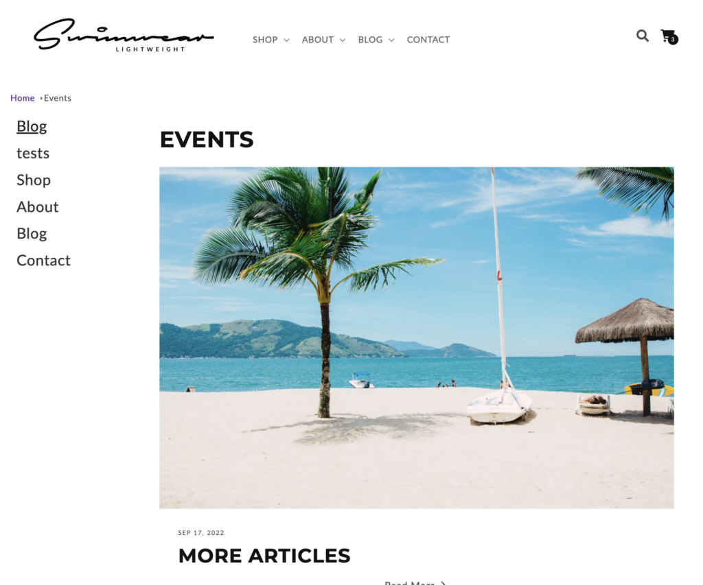
Blog
This section is only used in the blog template and shows a grid of blog posts of the corresponding blog. The first blog post is a featured blog post and is shown bigger than the rest of the posts.
- Blog Post Card settings:
- Show featured image. Whether or not to show the blog post image.
- Show date on the card
- Show author on the card
You can add sidebars to the blog posts grid. The sidebars stack vertically on each side of the grid. For each sidebar you can change:
- The heading of the sidebar
- The position of the sidebar. The position can be either left or right of the grid
- Whether to show product tags in the sidebar
- Choose a menu to show in the sidebar